My Truck
1978 Toyota

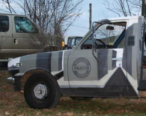
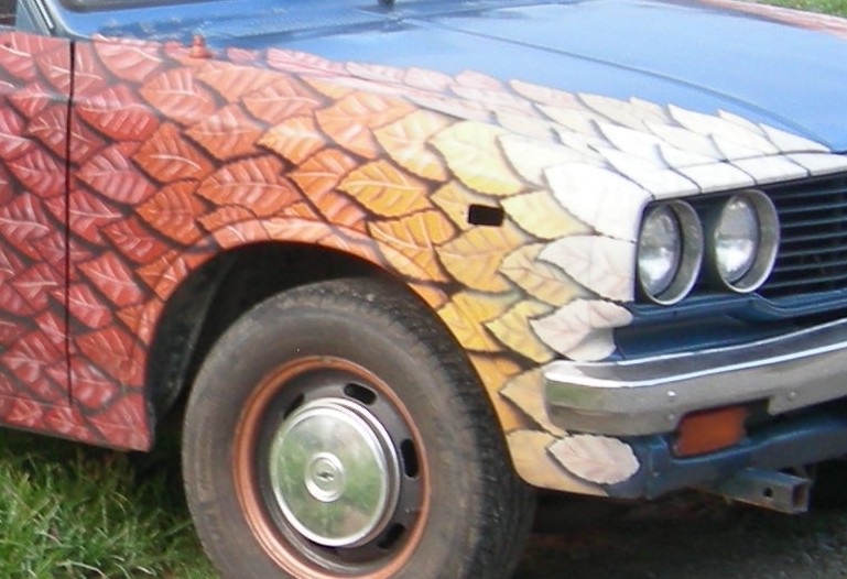
I haven't studied the theoriies behind camo schemes, but from what I understand, the idea is to break up the shape of the object. The theory here goes beyond that, in that it seeks to take the viewer's eye THROUGH the object, in a 3 D sense.
The scheme was inspired by the brush arbors that travelling ministers made long ago, in places where there was no church. Also special thanks to Chuck Colson for his book "How Now Shall We Live?"


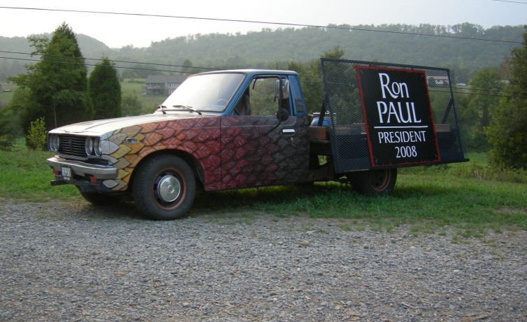
Here's a picture of the other side, taken under unusual lighting. The truck is a flatbed that I fabricated myself, it formerly was a camper-mini motorhome. On the driver's side of the bed is a removable material carrier. It's very similar to what glass companies use. I usually carry a sign with a message here. I hope the Ron Paul folks don't mind. This R.P. artwork is available as a vector file. I wanted a colonial look.
I would really enjoy discussing vehicle graphics with other Christian artists. It's a very visible, contemporary medium, with great possibilities for expression. Church vans might be a great place to render your ideas. I think Christians should be masterful in this area, the potential subject matter is broad. Secular vehicle graphics have degenerated to the death look. Often quite predictable. Repetitive stenciled skulls anyone? Ooh bad.